
Axes クラス (matplotlib.axes モジュール)
class Axes(matplotlib.axes._base._AxesBase)
継承:matplotlib.artist.Artist → matplotlib.axes._base._AxesBase → Axes
Contents
- 1 プロパティ
- 1.1 adjustable
- 1.2 anchor
- 1.3 aspect
- 1.4 autoscale_on
- 1.5 autoscalex_on
- 1.6 autoscaley_on
- 1.7 axes_locator
- 1.8 axisbelow
- 1.9 facecolor / fc
- 1.10 figure
- 1.11 frame_on
- 1.12 navigate
- 1.13 navigate_mode
- 1.14 position
- 1.15 prop_cycle
- 1.16 rasterization_zorder
- 1.17 title
- 1.18 xbound
- 1.19 xlabel
- 1.20 xlim
- 1.21 xmargin
- 1.22 xscale
- 1.23 xticklabels
- 1.24 xticks
- 1.25 ybound
- 1.26 ylabel
- 1.27 ylim
- 1.28 ymargin
- 1.29 yscale
- 1.30 yticklabels
- 1.31 yticks
- 2 インスタンスメソッド – Plotting
- 3 インスタンスメソッド – Appearance
- 4 インスタンスメソッド – Axis / limits
プロパティ
adjustable
anchor
aspect
autoscale_on
autoscalex_on
autoscaley_on
axes_locator
axisbelow
facecolor / fc
figure
frame_on
position
prop_cycle
rasterization_zorder
title
set_title(label, fontdict=None, loc=None, pad=None, **kwargs)
- 引数
- 戻り値
- text : 設定された文字列 <Text>
get_title(loc=’center’)
- 引数
- loc : どのタイトルを取得するか <{‘center’, ‘left’, ‘right’}>
- 戻り値
- title : タイトルの文字列 <str>
xbound
xlabel
set_xlabel(xlabel, fontdict=None, labelpad=None, **kwargs)
- 引数
- 戻り値
- return : 設定された文字列 <Text>
get_xlabel()
- 引数 : なし
- 戻り値
- return : X軸ラベルの文字列 <str>
xlim
set_xlim(left=None, right=None, emit=True, auto=False, *, xmin=None, xmax=None)
xmargin
xscale
xticklabels
set_xticklabels(labels, fontdict=None, minor=False, **kwargs)
- 引数
- 戻り値
- return : 生成されたTextインスタンスのリスト <list(Text)>
xticks
set_xticks(ticks, minor=False)
- 引数
- ticks : 作成するX軸の目盛りのリスト <list>
- minor : 主目盛り、補助目盛りのどちらを作成するかを指定します <bool>
- False -> 主目盛り
- True -> 補助目盛り
- 戻り値
- return : 作成したX軸目盛り <XTick>
ybound
ylabel
set_ylabel(xlabel, fontdict=None, labelpad=None, **kwargs)
- 引数
- 戻り値
- return : 設定された文字列 <Text>
get_ylabel()
- 引数 : なし
- 戻り値
- return : Y軸ラベルの文字列 <str>
ylim
set_ylim(bottom=None, top=None, emit=True, auto=False, *, ymin=None, ymax=None)
ymargin
yscale
yticklabels
set_yticklabels(labels, fontdict=None, minor=False, **kwargs)
- 引数
- 戻り値
- return : 生成されたTextインスタンスのリスト <list(Text)>
yticks
set_yticks(ticks, minor=False)
- 引数
- ticks : 作成するY軸の目盛りのリスト <list>
- minor : 主目盛り、補助目盛りのどちらを作成するかを指定します <bool>
- False -> 主目盛り
- True -> 補助目盛り
- 戻り値
- return : 作成したY軸目盛り <YTick>
インスタンスメソッド – Plotting
bar
bar(x, height, width=0.8, bottom=None, *, align=’center’, data=None, **kwargs)
- 引数
- x:棒グラフのX座標 <float / array-like>
- height:棒グラフの高さ <float / array-like>
- width:棒グラフの幅 <float / array-like>
- bottom:棒グラフの底面の高さ(デフォルトは0) <float / array-like>
- align:棒グラフのX軸の目盛りに対する配置 <{‘center’, ‘edge’}>
- data:グラフに表示するデータを、dictやDataFrameで指定 <dict / DataFrame>
- **kwargs:Rectangleクラスのプロパティを指定可能
- 戻り値
- retval:棒グラフやオプションのエラーバーを含んだコンテナ <BarContainer>
サンプルコード・解説記事
- コード例:基本的な棒グラフの作成方法
import matplotlib.pyplot as plt

x = [1, 2, 3, 4, 5, 6, 7, 8, 9, 10]
height = [1, 2, 1, 2, 4, 5, 3, 7, 5, 9]

fig, ax = plt.subplots()
ax.bar(x, height)
plt.show()

boxplot
boxplot(x, notch=None, sym=None, vert=None, whis=None, positions=None, widths=None, patch_artist=None, bootstrap=None, usermedians=None, conf_intervals=None, meanline=None, showmeans=None, showcaps=None, showbox=None, showfliers=None, boxprops=None, labels=None, flierprops=None, medianprops=None, meanprops=None, capprops=None, whiskerprops=None, manage_ticks=True, autorange=False, zorder=None, *, data=None)
errorbar
errorbar(x, y, yerr=None, xerr=None, fmt=”, ecolor=None, elinewidth=None, capsize=None, barsabove=False, lolims=False, uplims=False, xlolims=False, xuplims=False, errorevery=1, capthick=None, *, data=None, **kwargs)
hist
hist(x, bins=None, range=None, density=False, weights=None, cumulative=False, bottom=None, histtype=’bar’, align=’mid’, orientation=’vertical’, rwidth=None, log=False, color=None, label=None, stacked=False, *, data=None, **kwargs)
imshow
imshow(X, cmap=None, norm=None, aspect=None, interpolation=None, alpha=None, vmin=None, vmax=None, origin=None, extent=None, shape=None, filternorm=1, filterrad=4.0, imlim=None, resample=None, url=None, **kwargs)
サンプルコード・解説記事
import matplotlib.pyplot as plt
img = plt.imread(r'D:\BioTech-Lab\Lena.jpg')
fig, ax = plt.subplots()
ax.imshow(img)
plt.show()
plot
plot(*args, scalex=True, scaley=True, data=None, **kwargs)
- plot([x], y, [fmt], *, data=None, **kwargs)
- plot([x], y, [fmt], [x2], y2, [fmt2], …, **kwargs)
- 引数
- *args
- x : X座標の値、もしくはその配列 <array-like / scalar>
- y : Y座標の値、もしくはその配列 <array-like / scalar>
- fmt : プロットの形状を表すフォーマット文字列 <str>
- フォーマット文字列は ‘[marker][line][color]’ の3つの部分から成り、以下で示す文字列を組み合わせて指定します。
- scalex : X軸の描画範囲を与えられたデータに従って自動で決めるかどうか <bool>
- scaley : Y軸の描画範囲を与えられたデータに従って自動で決めるかどうか <bool>
- data : グラフに表示するデータを、dictやDataFrameで指定します <dict / DataFrame>
- **kwargs : Line2Dクラスのプロパティを指定可能
- *args
- 戻り値
- lines : 描画されたグラフを表すLine2Dオブジェクトのリスト <list(Line2D)>
折れ線グラフをAxesインスタンスに追加します。
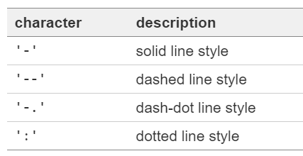
fmt引数で指定可能なフォーマット文字列は以下の組み合わせになります。

線のスタイル
色
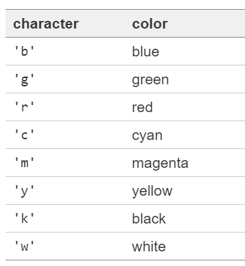
例えば、’o-b’とすると、マーカが●で、グラフは直線の青いグラフが表示されます。フォーマット文字列の指定する順番は順不同です。また、線のスタイルを指定しないと「線なし」のグラフ、つまり散布図になります。
サンプルコード・解説記事
x = [1, 2, 3, 4, 5, 6, 7, 8, 9, 10]
y1 = [0, 2, 1, 2, 4, 5, 3, 7, 5, 9]
y2 = [2, 1, 2, 3, 3, 2, 6, 5, 8, 7]

import matplotlib.pyplot as plt
fig, ax = plt.subplots()
ax.plot(x, y1, 'o-r', x, y2, 'x--b')
plt.show()

scatter
scatter(x, y, s=None, c=None, marker=None, cmap=None, norm=None, vmin=None, vmax=None, alpha=None, linewidths=None, verts=, edgecolors=None, *, plotnonfinite=False, data=None, **kwargs)
- 引数
- x : X座標の値、もしくはその配列 <float / array-like>
- y : Y座標の値、もしくはその配列 <float / array-like>
- s : マーカーのサイズ <float>
- (マーカーのポイント数)^2の数値でサイズを指定します。
- c : マーカーの色 <list(color) / color>
- 色の指定方法はこちらをご覧ください。
- marker : マーカーの種類 <MarkerStyle / str/ int>
- MarkerStyleオブジェクトか、もしくはその簡略表記法で指定します。
- cmap : カラーマップ
- alpha : マーカーの塗りつぶしの透明度 <float>
- linewidths : マーカーの輪郭の太さ <float / array-like>
- edgecolors : マーカーの輪郭の色 <{‘face’, ‘none’, None} / color>
- 戻り値
- collection : <PathCollection>
サンプルコード・解説記事
- 基本的な使い方:デフォルト設定での描画
x = [1, 2, 3, 4, 5, 6, 7, 8, 9, 10]
y = [0, 2, 1, 2, 4, 5, 3, 7, 5, 9]

import matplotlib.pyplot as plt
fig, ax = plt.subplots()
ax.scatter(x, y)
plt.show()
- 基本的な使い方:data引数にDataFrameを指定する方法
import pandas as pd
df = pd.read_excel('https://biotech-lab.org/wp-content/uploads/2020/08/4907-Sample-01.xlsx')

import matplotlib.pyplot as plt
fig, ax = plt.subplots()
ax.scatter('X', 'Y1', data = df)
plt.show()
text
text(x, y, s, fontdict=None, **kwargs)
- 引数
- 戻り値
- text : 生成されたテキストのインスタンス <Text>
サンプルコード・解説記事
import matplotlib.pyplot as plt
fig, ax = plt.subplots()
ax.set_axis_off()
ax.text(0, 0, 'Hello, World!')
plt.show()
violinplot
violinplot(dataset, positions=None, vert=True, widths=0.5, showmeans=False, showextrema=True, showmedians=False, quantiles=None, points=100, bw_method=None, *, data=None)
- 引数
- dataset : 入力データ(1次元配列) <array-like>
- 戻り値
- result : 生成されたバイオリンプロットの各要素を表す辞書 <dict>
インスタンスメソッド – Appearance
set_axis_off
set_axis_off()
- 引数 : なし
- 戻り値 : なし
グラフのX軸・Y軸を非表示にします。
set_axis_on
set_axis_on()
- 引数 : なし
- 戻り値 : なし
グラフのX軸・Y軸を表示させます。
インスタンスメソッド – Axis / limits
get_legend
get_legend()
- 引数 : なし
- 戻り値
- return : 凡例を表すオブジェクト、凡例が設定されていなければNone <Legend>
legend
legend(*args, **kwargs)
- legend()
- legend(labels)
- legend(handles, labels)